How to Create Email Headers in Canva: Newsletter Banner Sizes
Canva email headers should fit the narrow reality of newsletter inboxes. A 600 px-wide canvas is the classic safe starting point, with 600 × 200 px or 600 × 300 px working well for headers and 600 × 400 px for a taller hero banner.
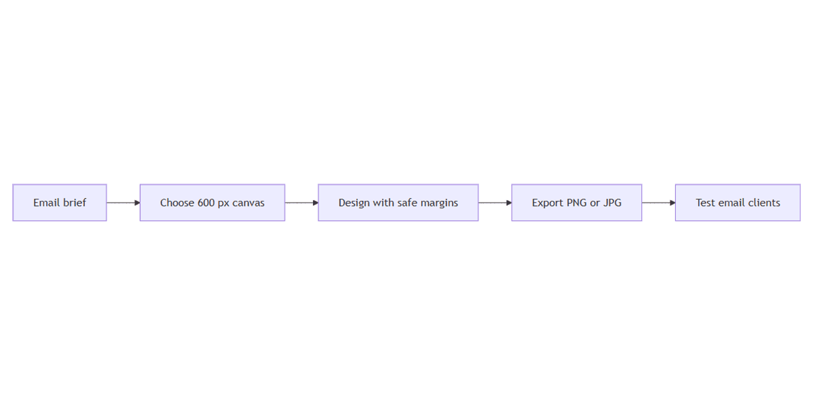
This guide covers email banner sizes, safe margins, dark-mode-aware design, Canva setup, and PNG/JPG export. Email is not a web hero or social preview, so start with email dimensions instead of shrinking a wide blog banner at the last minute.
Best email header sizes
Many email templates use a 600 px content width, while some modern systems use 640 px or 700 px. Match the width configured in your email platform whenever possible.
| Use | Recommended canvas | Notes |
|---|---|---|
| Compact newsletter header | 600 × 200 px | Logo, newsletter name, short label |
| Standard email header | 600 × 300 px | More room for image and headline |
| Email hero banner | 600 × 400 px | Campaign image and concise message |
| Alternative template width | 640 or 700 px wide | Use only when the email layout matches |
Header height commonly falls around 150–300 px. A hero can be 400–600 px tall, but taller art pushes the actual message below the fold on phones.
Which size should you choose?
- Use 600 × 200 px for a recurring newsletter masthead.
- Use 600 × 300 px for most branded email headers.
- Use 600 × 400 px for a campaign hero with a product or editorial image.
- Use the email platform's exact content width when it differs from 600 px.
Do not upscale a small image after export. Start at the intended display width or an approved higher-density workflow supported by your email builder, then test the actual message.
Email header vs blog banner vs Open Graph image
Email graphics are narrower than website and social assets:
| Asset | Typical size | Primary job |
|---|---|---|
| Email header | 600 × 200 or 600 × 300 px | Brand the top of a newsletter |
| Email hero | 600 × 400 px | Lead a promotion or story |
| Blog banner | 1600 × 800 px | Fill a wide article header |
| Open Graph image | 1200 × 630 px | Create a social link preview |
A Canva blog banner has far more horizontal space. Cropping it to email width can make text tiny or remove the subject. Rebuild the composition for the narrow canvas.
How to create an email header in Canva
- Open Canva.
- Click Create a design → Custom size.
- Choose pixels and enter 600 × 200, 600 × 300, or 600 × 400.
- Click Create new design.
- Start with a blank canvas or search for an email header or newsletter template.
- Confirm the template's dimensions before replacing its content.
See Canva's custom size guidance for current resizing controls and availability.
Step-by-step: design a readable header
1. Set safe margins
Keep important text and logos roughly 20–30 px from every edge on a 600 px-wide canvas. Add more breathing room around a detailed logo or when the email template itself adds padding.
Safe margins reduce the chance that tight mobile layouts, rounded containers, or an email builder's crop make the design look cramped.
2. Build a simple hierarchy
Use no more than three levels:
- Brand or newsletter name.
- Short issue title or campaign message.
- Optional date, category, or brief supporting line.
Avoid tiny text. Email images may be scaled down on phones, and text embedded in an image does not adapt like live HTML text.
3. Apply Brand Kit
Canva Brand Kit helps keep email headers consistent:
- Open Brand in the editor.
- Apply the approved palette and fonts.
- Add a logo with enough contrast.
- Use the same logo placement and margins each week.
- Save or duplicate the design for the next issue.
Brand Kit availability varies by plan and workspace permissions. If you do not have it, document the color values, fonts, spacing, and logo size in a master design.
4. Choose an image or background
- Use a solid color or restrained gradient for a lightweight masthead.
- Use one photo for a hero; avoid a collage of small details.
- Add a subtle overlay when text sits on a photo.
- Keep the focal subject away from edges that may be cropped.
- Test the design at the width it will appear in the email.
For isolated logos or marks, see the transparent PNG guide.
5. Design for dark and light email themes
Dark mode behavior varies by email client. Some clients invert backgrounds or text, while others leave image pixels unchanged.
- Put a defined background behind logos instead of assuming the email body stays white.
- Avoid a dark logo on a transparent background unless a light variant is also tested.
- Add a subtle outline or container around marks that can disappear after color changes.
- Keep strong contrast inside the image itself.
- Send test emails to multiple clients in both light and dark modes.
An image cannot guarantee identical rendering in every client. The goal is a design that remains recognizable and readable when surrounding email colors change.
Export PNG or JPG from Canva
- Click Share → Download.
- Choose PNG for logos, flat colors, icons, or crisp text.
- Choose JPG for photo-heavy banners when a smaller file matters.
- Download the file.
- Check its dimensions and file size before uploading.
Canva documents the standard download flow in Downloading designs.
| Format | Best for | Trade-off |
|---|---|---|
| PNG | Logos, text, flat graphics, transparency | Often larger |
| JPG | Photos and textured backgrounds | No transparency; compression artifacts |
Keep the image file small because large email assets slow loading and can hurt the mobile experience. There is no universal file-size limit across all senders and clients, so compress aggressively enough for your campaign platform, then inspect image quality.
Add the header to your email platform
- Upload the exported image to the email builder.
- Place it in a full-width image block inside the message's content column.
- Set useful alt text, such as the newsletter or campaign name.
- Avoid putting essential information only inside the image.
- Preview desktop and mobile layouts.
- Send test emails to several clients before scheduling.
Use live HTML text for dates, offer details, and calls to action when possible. Image blocking and accessibility tools can hide or miss text baked into a banner.
Use Magic Resize carefully
Magic Resize can create a 600 px-wide version from another campaign asset, but email width is a special layout constraint.
After resizing:
- Reframe the focal image for the narrower crop.
- Increase text size if the source came from a large web banner.
- Restore 20–30 px safe margins.
- Remove secondary copy that no longer fits.
- Export and test inside a real email.
Do not treat automatic resize as the finished email design.
Practical email header workflows
Weekly newsletter header
- Create a 600 × 200 px master.
- Add the newsletter logo and a short issue label.
- Duplicate it each week.
- Change only the issue color, date, or small illustration.
- Export PNG and test on mobile.
Promotional strip
- Create a shallow 600 px-wide banner.
- Use one short promotion, not a paragraph.
- Keep the real button as live HTML below the image.
- Export JPG for photography or PNG for flat graphics.
- Link the image only as a secondary click target.
Welcome email hero
- Create a 600 × 400 px hero.
- Add one welcoming image and a brief headline.
- Keep onboarding instructions as live text below.
- Test the logo and background in dark mode.
- Compress the export before adding it to the automation.
Email header checklist
- Width matches the email template, commonly 600 px
- Header is 200–300 px tall or hero is about 400 px tall
- Important content has 20–30 px safe margins
- Text remains readable on a phone
- Logo works against light and dark surroundings
- PNG or JPG chosen for the artwork type
- File size optimized
- Alt text added in the email builder
- Desktop, mobile, light mode, and dark mode tested
Common mistakes
- Starting from a 1600 px blog header and shrinking the text until it is unreadable.
- Using a very tall hero that pushes the email's purpose below the fold.
- Putting the entire offer inside the image with no accessible live text.
- Exporting every photo as PNG, creating a larger file than necessary.
- Assuming transparent logos work in dark mode without client testing.
- Skipping a test send and trusting only the email builder preview.
FAQ
What is the best width for an email header?
600 px is the classic safe width and a strong default. Some email templates use 640 or 700 px, so match the configured content column when you know it.
Should an email header be JPG or PNG?
Use PNG for logos, text-heavy graphics, flat colors, and transparency. Use JPG for photo-heavy headers when a smaller file is more important. Compare the exported quality and size.
How tall should a newsletter header be?
About 150–300 px is common. Start with 600 × 200 px for a compact masthead or 600 × 300 px for a standard header. Use 600 × 400 px for a taller hero.
How do I make an email header work in dark mode?
Give logos and text enough contrast within the image, avoid relying on a white email background, and send tests to several email clients in light and dark modes. Client behavior is not uniform.
Conclusion
For most Canva email headers, start at 600 × 200 px or 600 × 300 px; use 600 × 400 px for a hero. Keep 20–30 px safe margins, limit text, apply Brand Kit, and export an optimized PNG or JPG before testing in real email clients.
For wider website and social graphics, use the dedicated sizes in Canva blog banners. For clean logo assets, see transparent PNG. Use QR codes mainly when the email design will also appear in print, since an email reader is usually already on a clickable device.
Canva Templates
Start Selling Canva Templates - Start Now!